

A clickable button in DealHub helps users access resources while preserving their DealHub view. You can easily style this button to match your branding or workflow needs.
Here are step-by-step instructions:
1. Button Code Example
Paste this HTML block into a DealHub Text Answer field as Plain/Simple Text, then convert to Rich Text:
text
<p> <button style="font-size: 14px !important;min-width: 60px;outline: none !important;padding: .75rem 1rem !important;margin-right: .75rem;background-color: #32aed8;border: 0px solid #ccc;border-radius: 8px;"> <span> <a href="YOUR_PUBLIC_URL_HERE" target="_blank" rel="noopener noreferrer" style="color: #fff !important;">YOUR_BUTTON_TEXT_HERE</a> </span> </button> </p>
-
Change
YOUR_PUBLIC_URL_HEREto your public link andYOUR_BUTTON_TEXT_HEREto the button label. -
Important: Switching from Rich Text back to Plain/Simple Text will erase the HTML and its styles.
2. Button Design Options Explained
Each design property can be customized in the button style attribute:
-
Color: Change
background-colorfor button fill, andcoloron<a>for text color. -
Font Size: Tweak
font-sizefor larger or smaller button text. -
Padding: Modify for more or less space around the text.
-
Border Radius: Increase for more rounded buttons, decrease for sharp corners.
-
Border: Add visible borders if required.
-
Spacing:
margin-righthelps if you’ll have multiple buttons in a row.
3. Best Practices
-
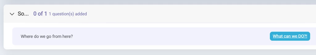
Use concise button text that clearly indicates the action (e.g., "Open Slide Deck", "Watch Video").
-
Make sure the link leads to public or client-accessible resources.
-
Consider accessibility: clarity in text and color contrast improves visibility for all users.